Sometimes you just need a project that you can put together in a short amount of time as you have a last minute gift you need or perhaps you’re working in bulk. Stampin’ Up! sell some gorgeous pre-made boxes ready for you to construct and decorate in any way you please. Today’s project uses the Simply Classic Treat Boxes which come with a white bottom and gold cube top, perfect as they are if you don’t wish or have time to decorate.

As the Gold co-ordinates perfectly with the Simply Elegant Designer Series Paper, I used that to decorate the panels on the top lidded section of the boxes. TIP: To get the Designer Series Paper to fit snug on the top panel of the box, you will need to punch a hole in the centre and feed the ribbon tag through. I show you how to do this in my tutorial below.
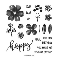
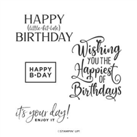
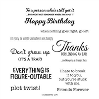
On the first sample, I made an error and used a ‘Thanks’ sentiment from the Hand-Penned Petals stamp set – I like how it looks, but I wanted to make sure I used everything from the same suite / bundle, so in my video I have used a ‘For You’ from the Elegantly Said stamp set. I love both of them, so just shows how versatile you can be!

To add a little more co-ordination, I included a small ribbon of Gold Trim and a Gold Metallic Pearl – love it. The best bit? This was made in approx. 15 minutes – great for bulk production!
Best Wishes,

Details below are for the colours and products used in my project today. Please remember, if you purchase from my store to add the host code (displayed in the top right sidebar) for orders under £150.
Details below are for the colours and products used in my project today. Please remember, if you purchase from my store to add the host code (displayed in the top right sidebar) for orders under £150.
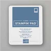
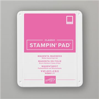
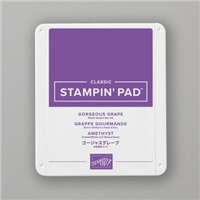
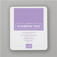
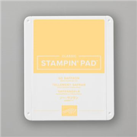
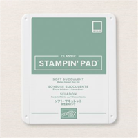
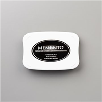
Colours Used:
Measurements:
- Designer Series Paper = 6 x 6 inches
- Belly Band = 6 x 11/2 inches
- Scrap for stamping & flowers
Scoring:
- Notch @ 2, 3, 4 inches on all four sides.
- Join the notches each with a score line diagonally (see video)
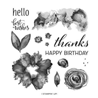
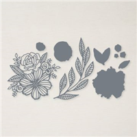
Supply List:

Please take the time to follow my blog, subscribe to my Youtube channel or visit me over on Facebook at Crafty Hullahbaloo, where you can share your inspiration too.