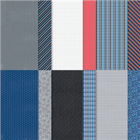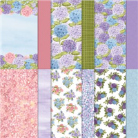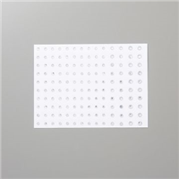

I say this every time I showcased a masculine card – but they are difficult to design when you need one on the spot. I like to have a couple of card choices already made for when an occasion comes round celebrating a male in my life. Well Suited is the Designer Series Paper (DSP) that features in today’s card – of course – and I decided to layer different patterns together on the card front.
This layering technique was first introduced to me by Sam over at Pootles Papercraft, where you cut down 3 or 4 patterns from a pack of paper and layer them up to make a card front, finishing it off with a simple sentiment / ribbon / embellishment.

I always try to choose two more subtle patterns and then pair them with one a little more funky / bright, which in this collection isn’t too bright but is far more patterned than the others and the tiny sentiment on the white catches your eye. Ready to gift to a dad for any occasion.
Have you tried a layered DSP card?
Best Wishes,
Suzanne
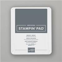
Colours Used:
Supplies: