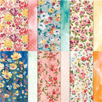

I am falling in love with the Berry Delightful and Berry Blessings set that come FREE as part of Sale-a-Bration. At first, the thought of fruit on a card didn’t appeal to me and I preferred the patterned sides of the paper. But the more I look at it, the more the fruit draws me in. And this card will hopefully show you why!
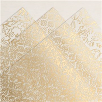
The colours on this particular pattern are gorgeous, they open you up to endless colour choices for a project and make life that bit easier when understanding what you are going use. When I first saw this pattern, I knew it had to be a project that showed off the paper, with minimal stamping – so a card seemed the perfect opportunity.

With a quick sentiment at the bottom and a strawberry fussy cut from a left over piece. This card is too cute to keep! A close up of the paper pattern above should show you why. Anyone who receives that won’t be able to stop themselves from falling in love with it too.
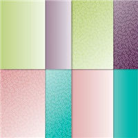
Have you seen the other designs in the pack too?
Best Wishes,
Suzanne
Colours Used:
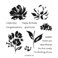
Supplies: