I love trying out new techniques, but then I also have a set of techniques I like to keep going back to as part of my card making. As part of an event that Stampin’ Up! held in April for Demonstrators, we had to make a swap with the stamp set ‘Etched in Nature’. I loved the sketchy nature of the stamps, but wanted to make a card focused around the butterfly.
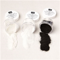
Heating embossing with white and then blending over the top is just a gorgeous look, no matter what stamp set or colours you use. It picks how the detail on the butterfly really nicely – isn’t it gorgeous?
Disclaimer: Unfortunately, the stamp set used on this card has since been withdrawn (perhaps only temporarily) due to quality issues. Stampin’ Up! believes in only selling items that continue to meet their high standards.

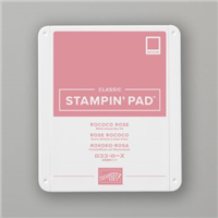
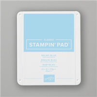
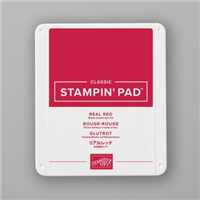
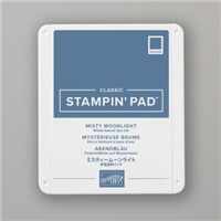
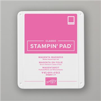
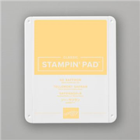
The background is blended from Misty Moonlight, Magenta Madness & So Saffron to create the gorgeous ombre effect seen. My inspiration being a sunset in a tropical location – just as the sun is disappearing below the horizon.
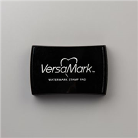
And to pop the sentiment away from the background, I use my ever faithful white embossing on black with just the most beautiful sentiment “When being together is more important than what you do, you’re with a friend”, which I think is very poignant given the past 12 months the world has been through.

What is one of your favourite techniques on a card? Tell me in the comments below.
Best Wishes,

Details below are for the colours and products used in my project today. Please remember, if you purchase from my store to add the host code (displayed in the top right sidebar) for orders under £150.
Details below are for the colours and products used in my project today. Please remember, if you purchase from my store to add the host code (displayed in the top right sidebar) for orders under £150.
Colours Used:
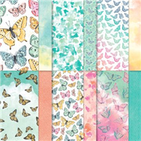
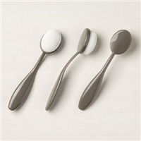
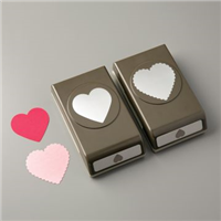
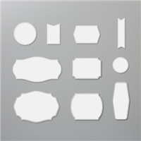
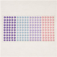
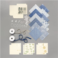
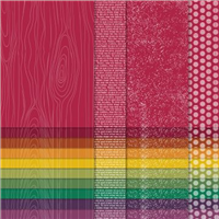
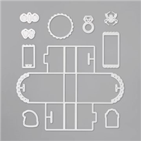
Supply List:


Please take the time to follow my blog, subscribe to my Youtube channel or visit me over on Facebook at Crafty Hullahbaloo, where you can share your inspiration too.