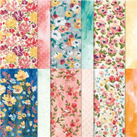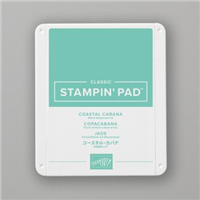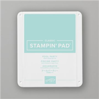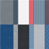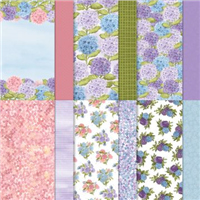

I first made this box on the day my pre-order from Stampin’ Up! arrived. The grey background on the paper with the bright colours instantly drew me in. I didn’t know what I was going to make, but knew it had to be with that particular pattern. The grey background contrasts beautifully with Coastal Cabana, so that formed the colour theme of my box.
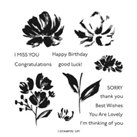
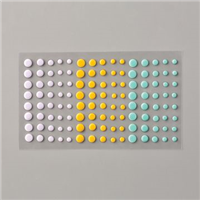
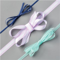
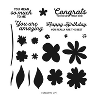
Using Fine Art Floral and some two step stamping, the picture really shines on the box. The colour theme also allowed me to bring out one of my favourite sets in the Annual Catalogue – Playing with Patterns, using both the embellishments and the ribbon.

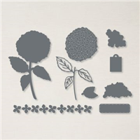
And the best part? The darker shades on each of the flower heads is the same stamp. It has been designed to work with all three flowers, which I think is pure genius! And the box itself, well as the video shows – this can be made in bulk as it’s easy peasy to put together.
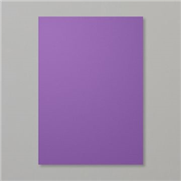
Which colour do you prefer, Coastal Cabana or Real Red?
Best Wishes,
Suzanne
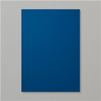
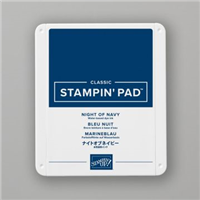
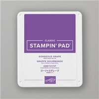
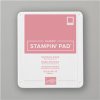
Colours Used:
Measurements:
- Cardstock = 91/2 x 71/2 inches
- Designer Series Paper = 6 x 12 inches
- Cardstock Scrap = 31/4 x 23/4 inches
- Basic White Scrap = 3 x 21/2 inches
Scoring:
Cardstock:
- Long Side = 3, 41/2, 71/2, 9 inches
- Short Side = 11/2 inches
Designer Series Paper
- Long Side = 51/4 inches on both sides
- Short Side = 11/2 inches on both sides
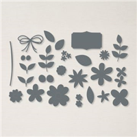
Supplies: