Paper Wishes

Welcome to my Butterfly Bouquet spotlight week – this week will feature 7 video tutorials posted back to back to spotlight this early release collection from the 2021-2022 Annual Catalogue. The collection is made up of several components – Stamps, Dies, Designer Series Paper (DSP) and Specialty Paper.

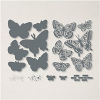
Are you enjoying my showcase so far? I think this collection is absolutely gorgeous, so I hope you are taking inspiration from the projects I have made. Today is project number 4 and I thought I would mimic the layout of one of the Designer Series Paper layouts to form a card front, except onto a different background. As you will see in my video, I use the large die from the Brilliant Wings set to help form the layout and act as a template for placing the butterflies down.

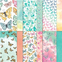
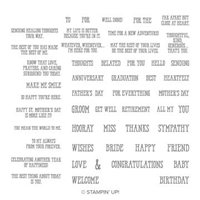
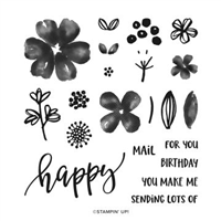
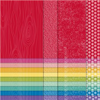
Of the Ombre / Watercolour designs, I really love the one that looks almost like a rainbow effect so chose that one as the focus of my background. When you have such subtle colours like the ones in the Designer Series Paper (DSP), something needs to be added that ‘pops’ off the page. For me, that had to be the sentiment and the Well Said stamp set lends itself well to singular word placement.

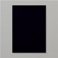
I chose to emboss my sentiment to get that ‘pop’ off the page, bringing in the contrast of white on black. This one is based on a birthday, but the Well Said stamp set means you could adapt this to any occasion – it has so many singular words and phrases, it is definitely a great set to have amongst your stash.

Which project has been your favourite so far? I hope you’ll join me again tomorrow!

Best Wishes,
Suzanne

Measurements:

  • Card Base = 81/4 x 57/8 inches (scored at 41/8)
  • Designer Series Paper = 37/8 x 55/8 inches
  • Basic Black Scrap

Supply List:

Happy Saffron

Welcome to my Butterfly Bouquet spotlight week – this week will feature 7 video tutorials posted back to back to spotlight this early release collection from the 2021-2022 Annual Catalogue. The collection is made up of several components – Stamps, Dies, Designer Series Paper (DSP) and Specialty Paper.

One of the best creative techniques I have learnt whilst stamping / crafting along with others, is the tone on tone technique. I love how just having one colour ink and the matching card stock creates such a subtle, but beautiful decoration on any project. Inspiration for today’s card was taken from the colours featured in the Designer Series Paper (DSP) in the Butterfly Bijou paper stack.

So Saffron is such a gorgeous colour, I’m not a massive fan of yellows but the subtle nature of So Saffron gets past my yellow barrier and I just couldn’t turn down the opportunity to work with that pretty large butterfly or the Natural Touch Specialty Paper.

As the Butterfly Brilliance stamp set does not feature any sentiments, I have teamed today’s project with the Pretty Perennials stamp set. I cannot stop using this large happy stamp and fussy cutting it to sit on my projects. You’ll see that it features a few more times this week!

As always, if you like my projects and enjoy my videos, please pop over to my Youtube channel and subscribe to keep up with my crafty makes. You can also find me on Instagram or Facebook.

Best Wishes,
Suzanne

Measurements:

  • So Saffron Cardstock = 57/8 x 81/4 inches
  • Natural Touch Specialty Paper = 3 x 3 inches
  • Basic White Scraps
  • Die Cut Butterfly from Butterfly Bijou Designer Series Paper

Supply List:

Bright Birthdays

As part of the joining offer during Sale-a-Bration, you can earn a FREE set of Designer Series Paper (DSP). When I say set, I mean 5 PACKETS!!! of yet to be released paper from the upcoming Annual Catalogue in June. That’s right, you can get them ahead of everyone. Even demos can no longer get their hands on these, as the pre-order time period is over. So if you join my team before 28th February 2021, you can earn the paper that made this card.

Of the five packs, I chose to go with the Brights collection. I usually fall into the trap of sticking to the Subtles or the Regals, so took a bit of a lane swerve. I love the colours that I chose, they go together so well; Pacific Point, Gorgeous Grape, Granny Apple Green and Daffodil Delight.

I wanted to match the stamping to the strips in the background, so used the same technique seen yesterday on my Simple Sunday series by using Stampin’ Write markers to colour sections of the sentiment. Which I think stamped rather well!

Have you seen the joining offer and been tempted? Ask me how before it’s too late!

Best Wishes,
Suzanne

Colours Used:

Supplies: