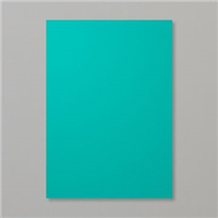
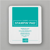
When I get stuck in a phase of using the same colours, I take a good look at my ink shelves and take five colours that I haven’t used recently and use at least one of them on the next project. I did go through a stage of using Bermuda Bay all the time, it was my colour of choice – it’s also my daughter’s favourite Stampin’ Up! colour.
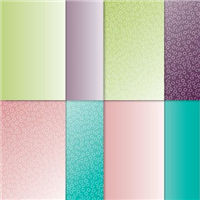
So with Bermuda Bay chosen, I set out to make a monochrome card. It’s pure coincidence that Bermuda Bay happens to be one of the colour choices in the Oh so Ombre FREE Sale-a-Bration paper, and I course went with my favourite design – the bubbles (as I call them!).
And rest, as they say, is history. The card brought itself together and made a brilliantly monochrome birthday card.
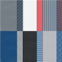
I say this every time I showcased a masculine card – but they are difficult to design when you need one on the spot. I like to have a couple of card choices already made for when an occasion comes round celebrating a male in my life. Well Suited is the Designer Series Paper (DSP) that features in today’s card – of course – and I decided to layer different patterns together on the card front.
This layering technique was first introduced to me by Sam over at Pootles Papercraft, where you cut down 3 or 4 patterns from a pack of paper and layer them up to make a card front, finishing it off with a simple sentiment / ribbon / embellishment.
I always try to choose two more subtle patterns and then pair them with one a little more funky / bright, which in this collection isn’t too bright but is far more patterned than the others and the tiny sentiment on the white catches your eye. Ready to gift to a dad for any occasion.
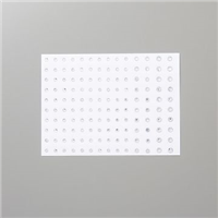
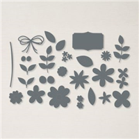
Welcome to my new Sunday series, affectionately known as Simple Sunday! The aim of this series is to showcase projects using minimal supplies, ideal for the beginner crafter or someone new to Stampin’ Up! Each project is a white card base with a 3×3 panel decorated using a single stamp set or die set. This week’s project features a stamp and die bundle that you can purchase from the January to June 2021 Mini Catalogue.
My main focus of today’s project was the dies, they are absolutely gorgeous and the pierced detail on the flowers really adds a beautiful touch to your project. The dies contain varying leaf shapes, flowers of varying size plus their middles so you can really build up a bouquet or arrangement or any shape or size.
I stamped my sentiment to the 3×3 panel and then just die cut flowers and leaves in vary colours to build up the floral arrangement. I took my colour inspiration from the co-ordinating Designer Series Paper which you can earn for free with a qualifying £45 purchase.
Mixing and matching is a big part of the fun when crafting. Grabbing different colours, stamp sets, dies etc and bringing them together to create final project. This particular project is a great example of that – where originally I wanted to make a plaid top to sit on a box lid, but then somehow created a card front fit for a daddy’s birthday.
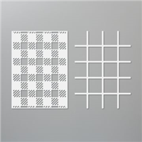
The Plaid Builder dies have been in my stash since the Annual Catalogue launched back in June, but have yet to be used on a project. They’re the perfect size for a card front, so when I realised the size, my plan quickly changed.
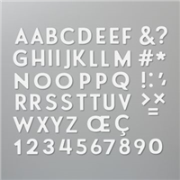
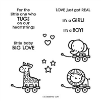
One of the dies as part of the Plaid Builder has cute little squares as off cuts, so I recycled these and paired them up with the Playful Alphabet dies to spell out ‘Daddy’ and then teamed it with the Baby Pull Toys and sets to really finish the project off. I love it!
Have you used the Plaid Builder dies? Perhaps you could join my Crafty Hullahbaloo Facebook group and share your makes?
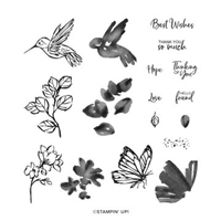
Welcome to my new Sunday series, affectionately known as Simple Sunday! The aim of this series is to showcase projects using minimal supplies, ideal for the beginner crafter or someone new to Stampin’ Up! Each project is a white card base with a 3×3 panel decorated using a single stamp set or die set. This week’s project features a stamp set that you can earn FOR FREE during Sale-a-Bration between 5th January and 28th February.
Touch of Ink – this has to be my most favourite stamp set of any Sale-a-Bration that I have been part of. So I decided to add an extra card in this week for my Simple Sunday. I absolutely love both of them for different reasons.
The softer colours of the hummingbird card vs the brighter hues of the butterfly, both of them are gorgeous in their own way and I really enjoyed making them both. The stamp set is two step – which means you can stamp the outline and then get another stamp to infill – leaving you a whole host of different colour combinations.
As you can see, I went for more muted tones for the Hummingbird hovering over the sweet flowers using four separate colours to show a difference between the outline and fill colours. The Hummingbird is them popped up on dimensionals to give some extra shadow on the card itself.
The Butterfly is popped up in the same way, but the colours are a little less muted. However, this doesn’t change just how pretty the card looks. They’re both equally beautiful.
I hope you find my Simple Sunday Series useful and it shows you that you don’t have to throw everything craft product you own to create a pretty project.