Matchbox Birthday

Welcome to my Butterfly Bouquet spotlight week – this week will feature 7 video tutorials posted back to back to spotlight this early release collection from the 2021-2022 Annual Catalogue. The collection is made up of several components – Stamps, Dies, Designer Series Paper (DSP) and Specialty Paper.

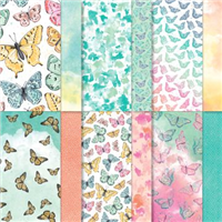
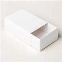
Eek! I’m so excited to show you this project – it’s so so easy to make and is so cute! Today’s project features the Designer Series Paper (DSP) from the Butterfly Bouquet collection – this paper is an exclusive which will only be available during this promotion and it is absolutely gorgeous! I’ve teamed the paper up with the Treat Boxes from the Love you Always suite in the Jan to June Mini Catalogue. These are a really good size and so can be filled with plenty of treats to gift to someone as a thank you, a congratulations or even part of a birthday gift!

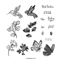
Using one of the leftover butterflies that I cut out for yesterday’s project, I wrapped the outer layer of the treat box with a piece of Designer Series Paper cut to fit. The paper instantly gives the box a lift and makes it feel special even without the extra decoration.

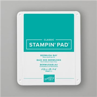
The second largest butterfly then makes its appearance on the front with a quick sentiment in Bermuda Bay to match the paper. I love how it looks when finished and I still have plenty of butterflies left for more projects!

Have you been tempted by the Butterfly Bouquet collection yet? If you have and want to get your hands on it, click the links at the bottom of this page.

Best Wishes,
Suzanne

Measurements:

  • Designer Series Paper = 53/4 x 4 inches
  • Basic White Scrap

Supply List:

Simple Sunday #13 – Dragonfly Garden

Welcome to my new Sunday series, affectionately known as Simple Sunday! The aim of this series is to showcase projects using minimal supplies, ideal for the beginner crafter or someone new to Stampin’ Up! Each project is a white card base with a 3×3 panel decorated using a single stamp set or die set. This week’s project features a stamp and punch bundle that you can purchase from the January to June 2021 Mini Catalogue.

I absolutely love a punch bundle – there’s nothing better than being able to sit there and mass produce cards / boxes with toppers that include punches. Don’t get me wrong, dies are beautiful, but I find a punch much faster and sometimes time is of the essence!

On this card, I didn’t want to use too many products as that would distract from the simple nature of the series I set out to create, but sometimes the Stampin’ Write Markers are overlooked – especially following the release of the Stampin’ Blends. So I wanted to make sure that new crafters could see that you don’t need everything right away. If you don’t have the inks, you can use the markers instead and they are cost effective to buy in bulk than the ink pads.

For some final dimension on this card, I lifted the dragonfly using dimensionals and coloured in the outline using Wink of Stella to bleed the ink and add some gorgeous sparkle.

What do you think? Are you going to try out the marker ink technique?

Best Wishes,
Suzanne

Colours Used:

Supplies:

Prism Congrats

How amazing is the new Hydrangea Hill Mercury Acetate? I couldn’t wait to get my hands on a pack of it – not only because it contains purple either! The pack contains two different colours, Highland Heather & Rococo Rose, both equally beautiful. My box is made from Highland Heather and during my Facebook Live, I made one using Designer Series Paper (DSP) from the Snail Mail suite.

The box is a prism slider, where the acetate or DSP acts as a ‘wrap’ around the inner card box. It’s a good size and will hold a varying amount of sweet treats or jewellery – perhaps even stationary. Because of the acetate and how stunning it looks, I didn’t need to add much more to get a gorgeous finish to the project.

A quick bow using the Gorgeous Grape sheer ribbon, a couple of flowers from the Hydrangea dies and a sentiment from the ‘You are Amazing’ stamp set. Quick and easy project which showcases the suite perfectly.

Which way did you prefer – acetate or Designer Series Paper?

Best Wishes,
Suzanne

Colours Used:

Measurements:

  • Designer Series Paper = 63/4 x 8 inches
  • Cardstock = 71/2 x 113/4 inches
  • Scraps for stamping.

Scoring:

  • 21/2 inches on all four sides

Supplies:

Plaid Daddy

Mixing and matching is a big part of the fun when crafting. Grabbing different colours, stamp sets, dies etc and bringing them together to create final project. This particular project is a great example of that – where originally I wanted to make a plaid top to sit on a box lid, but then somehow created a card front fit for a daddy’s birthday.

The Plaid Builder dies have been in my stash since the Annual Catalogue launched back in June, but have yet to be used on a project. They’re the perfect size for a card front, so when I realised the size, my plan quickly changed.

One of the dies as part of the Plaid Builder has cute little squares as off cuts, so I recycled these and paired them up with the Playful Alphabet dies to spell out ‘Daddy’ and then teamed it with the Baby Pull Toys and sets to really finish the project off. I love it!

Have you used the Plaid Builder dies? Perhaps you could join my Crafty Hullahbaloo Facebook group and share your makes?

Best Wishes,
Suzanne

Colours Used:

Supplies:

Simple Sunday #10 – Touch of Ink

Welcome to my new Sunday series, affectionately known as Simple Sunday! The aim of this series is to showcase projects using minimal supplies, ideal for the beginner crafter or someone new to Stampin’ Up! Each project is a white card base with a 3×3 panel decorated using a single stamp set or die set. This week’s project features a stamp set that you can earn FOR FREE during Sale-a-Bration between 5th January and 28th February.

Touch of Ink – this has to be my most favourite stamp set of any Sale-a-Bration that I have been part of. So I decided to add an extra card in this week for my Simple Sunday. I absolutely love both of them for different reasons.

The softer colours of the hummingbird card vs the brighter hues of the butterfly, both of them are gorgeous in their own way and I really enjoyed making them both. The stamp set is two step – which means you can stamp the outline and then get another stamp to infill – leaving you a whole host of different colour combinations.

As you can see, I went for more muted tones for the Hummingbird hovering over the sweet flowers using four separate colours to show a difference between the outline and fill colours. The Hummingbird is them popped up on dimensionals to give some extra shadow on the card itself.

The Butterfly is popped up in the same way, but the colours are a little less muted. However, this doesn’t change just how pretty the card looks. They’re both equally beautiful.

I hope you find my Simple Sunday Series useful and it shows you that you don’t have to throw everything craft product you own to create a pretty project.

Which colour way / card do you prefer?

Best Wishes,
Suzanne

Colours Used:

Supplies: