
Sometimes I really struggle for inspiration and sometimes inspiration comes at the craziest of times. My daughter Mia is currently studying Art as part of the option set she chose for GCSE and their current material of choice is watercolour. It was one of her recent pieces of work that inspired this card and the colour choices.

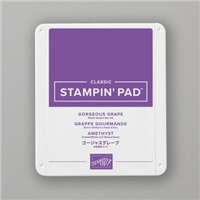
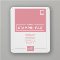
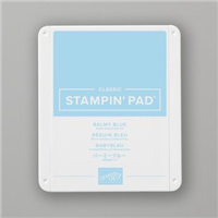
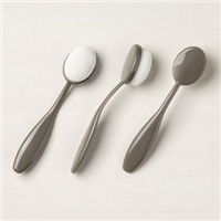
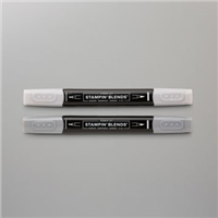
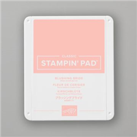
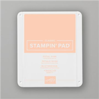
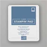
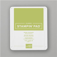
Whilst I didn’t do watercolour myself, I went with three similar colours to blend a background going for the more subtle pastel type shades. These were applied using the blending brushes from the Mini Catalogue, which allow you to blend onto card much more evenly that daubers or sponges do.
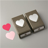
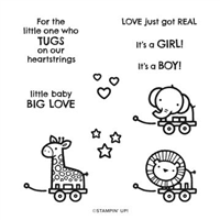
Mia decided to use a black outline for each focal point – the eye. However, I felt I didn’t need that due to the muted shades that I chose for my background. So simply punched out a Basic White heart and popped it up on dimensionals with a die cut sentiment.

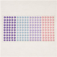
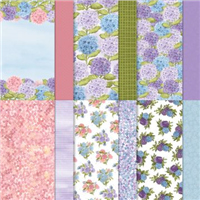
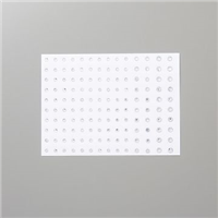
My final touch was a few of the pearls from the Hydrangea Suite – gorgeous!
Where do you go when you need inspiration?
Best Wishes,
Suzanne
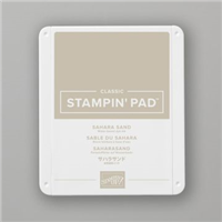
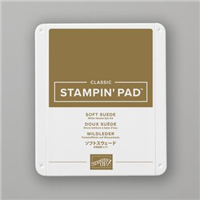
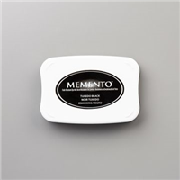
Colours Used:
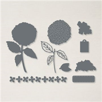
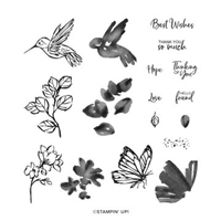
Supplies: