Golden Perfection

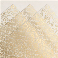
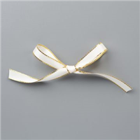
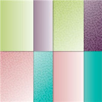
One of my favourite combos is Black and Gold and I absolutely love when I can bring all the co-ordinating items onto a single project like this one – ribbon, embellishments, embossing powder – all matching to really bring the box to light. The acetate acts as a slider on the box for added wow, which I love as it gives it a special something elevating it over any other box you may make.

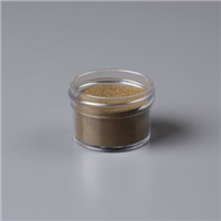
I don’t get my embossing powders out as often as I should, but powder is the only way to get that gorgeous look to the sentiment. Gold was the theme for the sample I made, but in my video I switched to Silver to show the variety the acetate brings – I’m not sure which one I prefer more!

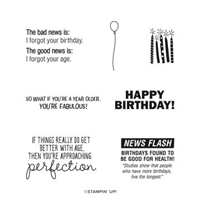
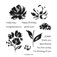
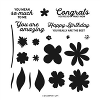
And don’t you just love the sentiment? The mixture of two fonts is gorgeous, and to make things even better, the stamp set is one of the FREE choices as part of Sale-a-Bration until 28th February 2021. The finished size is really good too and will fit plenty of treats inside.

Have you purchased any of the Golden Garden Acetate yet? If not, why not?

Best Wishes,
Suzanne

Colours Used:

Measurements:

  • Cardstock = 81/2 x 111/2 inches
  • Acetate = 51/2 x 12 inches

Scoring:

  • Long side = 4, 51/2, 91/2, 11 inches
  • Short side = 11/2 inches on each side

Supplies:

Bermuda Birthday

When I get stuck in a phase of using the same colours, I take a good look at my ink shelves and take five colours that I haven’t used recently and use at least one of them on the next project. I did go through a stage of using Bermuda Bay all the time, it was my colour of choice – it’s also my daughter’s favourite Stampin’ Up! colour.

So with Bermuda Bay chosen, I set out to make a monochrome card. It’s pure coincidence that Bermuda Bay happens to be one of the colour choices in the Oh so Ombre FREE Sale-a-Bration paper, and I course went with my favourite design – the bubbles (as I call them!).

And rest, as they say, is history. The card brought itself together and made a brilliantly monochrome birthday card.

What colour would you have chosen?

Best Wishes,
Suzanne

Colours Used:

Supplies:

Floral Thanks

I first made this box on the day my pre-order from Stampin’ Up! arrived. The grey background on the paper with the bright colours instantly drew me in. I didn’t know what I was going to make, but knew it had to be with that particular pattern. The grey background contrasts beautifully with Coastal Cabana, so that formed the colour theme of my box.

Using Fine Art Floral and some two step stamping, the picture really shines on the box. The colour theme also allowed me to bring out one of my favourite sets in the Annual Catalogue – Playing with Patterns, using both the embellishments and the ribbon.

And the best part? The darker shades on each of the flower heads is the same stamp. It has been designed to work with all three flowers, which I think is pure genius! And the box itself, well as the video shows – this can be made in bulk as it’s easy peasy to put together.

Which colour do you prefer, Coastal Cabana or Real Red?

Best Wishes,
Suzanne

Colours Used:

Measurements:

  • Cardstock = 91/2 x 71/2 inches
  • Designer Series Paper = 6 x 12 inches
  • Cardstock Scrap = 31/4 x 23/4 inches
  • Basic White Scrap = 3 x 21/2 inches

Scoring:

Cardstock:

  • Long Side = 3, 41/2, 71/2, 9 inches
  • Short Side = 11/2 inches

Designer Series Paper

  • Long Side = 51/4 inches on both sides
  • Short Side = 11/2 inches on both sides

Supplies:

Best Suited Dad

I say this every time I showcased a masculine card – but they are difficult to design when you need one on the spot. I like to have a couple of card choices already made for when an occasion comes round celebrating a male in my life. Well Suited is the Designer Series Paper (DSP) that features in today’s card – of course – and I decided to layer different patterns together on the card front.

This layering technique was first introduced to me by Sam over at Pootles Papercraft, where you cut down 3 or 4 patterns from a pack of paper and layer them up to make a card front, finishing it off with a simple sentiment / ribbon / embellishment.

I always try to choose two more subtle patterns and then pair them with one a little more funky / bright, which in this collection isn’t too bright but is far more patterned than the others and the tiny sentiment on the white catches your eye. Ready to gift to a dad for any occasion.

Have you tried a layered DSP card?

Best Wishes,
Suzanne

Colours Used:

Supplies:

Simple Sunday #11 – In Bloom

Welcome to my new Sunday series, affectionately known as Simple Sunday! The aim of this series is to showcase projects using minimal supplies, ideal for the beginner crafter or someone new to Stampin’ Up! Each project is a white card base with a 3×3 panel decorated using a single stamp set or die set. This week’s project features a stamp and die bundle that you can purchase from the January to June 2021 Mini Catalogue.

My main focus of today’s project was the dies, they are absolutely gorgeous and the pierced detail on the flowers really adds a beautiful touch to your project. The dies contain varying leaf shapes, flowers of varying size plus their middles so you can really build up a bouquet or arrangement or any shape or size.

I stamped my sentiment to the 3×3 panel and then just die cut flowers and leaves in vary colours to build up the floral arrangement. I took my colour inspiration from the co-ordinating Designer Series Paper which you can earn for free with a qualifying £45 purchase.

How gorgeous is the finished card?

Best Wishes,
Suzanne

Colours Used:

Supplies: